GAMMA
96
/* What it does:Prevents Gmail from displaying a download button on large, non-linked images. */
.g-img + div {
display: none !important;
opacity: 0.01 !important;
}
/* iOS, Gmail, and Samsung LINK FIX */
u + .body .blueLinks a {
color: inherit !important;
text-decoration: none !important;
font-size: inherit !important;
font-family: inherit !important;
font-weight: inherit !important;
line-height: inherit !important;
}
a[x-apple-data-detectors] {
color: inherit !important;
text-decoration: none !important;
font-size: inherit !important;
font-family: inherit !important;
font-weight: inherit !important;
line-height: inherit !important;
}
#MessageViewBody .blueLinks a {
color: inherit !important;
text-decoration: none !important;
font-size: inherit !important;
font-family: inherit !important;
font-weight: inherit !important;
line-height: inherit !important;
}
.blueLinks a {
color: inherit !important;
text-decoration: none !important;
}
body * {
mso-hyphenate: none !important;
hyphens: none !important;
word-break: normal !important;
}
/* Display classes */
.display-block{display:block !important;}
.mobile-hide {display: block !important;}
.mobile-show {display: none !important; overflow: hidden !important; max-height: 0 !important;}
@media screen and (max-width: 599px) {
h1, .h1 {
font-size: 30px !important;
line-height: 32px !important;
}
h2 {
font-size: 28px !important;
line-height: 30px !important;
}
h3 {
font-size: 24px !important;
line-height: 26px !important;
}
h4 {
font-size: 22px !important;
line-height: 24px !important;
}
.two-col .column {
max-width: 100% !important;
margin-left: 0 !important;
margin-right: 0 !important;
}
.mt-20 {
margin-top:20px !important;
}
.mlr-0 {
margin-left:0 !important;
margin-right:0 !important;
}
.mlr-6p {
margin-left:6% !important;
margin-right:6% !important;
}
.ta-c {
text-align: center !important;
}
.h-reset {height:initial !important;}
.w-28p {width:28% !important;}
.w-72p {width:72% !important;}
.w-80p {width:80% !important;}
.w-90p {width:90% !important;}
.hide, .mobile-hide {
display:none !important;
}
.mobile-show {
display: block !important;
font-size:initial !important;
line-height:initial !important;
max-height:initial !important;
mso-hide:none !important;
margin: 0 auto !important;
}
.bg_mobile {
background-position: 75% 50% !important;
}
}
@media screen and (max-width: 370px) {
h1 {
font-size: 34px !important;
line-height: 36px !important;
}
.button-container {
padding: 304px 0 0 !important;
}
}
@media screen and (max-width: 340px) {
.buttonlink {
font-size: 16px !important;
padding: 12px 16px !important;
}
}
body, h1, h2, h3, h4, h5, h6 p, a {
mso-hyphenate: none !important;
font-family: 'Segoe UI', 'Helvetica Neue', Helvetica, Arial,sans-serif !important;
}
/*Force a font fallback to Arial*/
table, tr, th, td {
border-collapse: collapse;
border-spacing: 0;
mso-table-lspace: 0pt !important;
mso-table-rspace: 0pt !important;
font-family: 'Segoe UI', 'Helvetica Neue', Helvetica, Arial,sans-serif !important;
}
h1, h2, h3, h4, h5, h6 p, a {
font-family: 'Segoe UI', 'Helvetica Neue', Helvetica, Arial,sans-serif !important;
}
p {
font-size: 20px !important;
}
/*h1, h2 {
font-weight: normal !important;
}
h4, h5, h6, p, a {
font-weight: normal !important;
}
h3 {
font-weight: bold !important;
}*/
sup {
font-size: 100% !important;
}
.buttonlink {
background: transparent !important;
}
.keep-white {
mso-style-textfill-type:gradient;
mso-style-textfill-fill-gradientfill-stoplist:"0 \#fefefe 0 100000\,100000 \#fefefe 0 100000";
color: #000000 !important;
}
.keep-black {
mso-style-textfill-type:gradient;
mso-style-textfill-fill-gradientfill-stoplist:"0 \#000000 1 100000\,99000 \#000000 1 100000";
color: #fefefe !important;
}
Gamma 5: our biggest update ever ͏ ͏ ͏ ͏ ͏ ͏ ͏ ͏ ͏ ͏ ͏ ͏ ͏ ͏ ͏ ͏ ͏ ͏ ͏ ͏ ͏ ͏ ͏ ͏ ͏ ͏ ͏ ͏ ͏ ͏ ͏ ͏ ͏ ͏ ͏ ͏ ͏ ͏ ͏ ͏ ͏ ͏ ͏ ͏ ͏ ͏ ͏ ͏ ͏ ͏ ͏ ͏ ͏ ͏ ͏ ͏ ͏ ͏ ͏ ͏ ͏ ͏ ͏ ͏ ͏ ͏ ͏ ͏ ͏ ͏ ͏ ͏ ͏ ͏ ͏ ͏ ͏ ͏ ͏ ͏ ͏ ͏ ͏ ͏ ͏ ͏ ͏ ͏ ͏ ͏ ͏ ͏ ͏ ͏ ͏ ͏ ͏ ͏ ͏ ͏ ͏ ͏ ͏ ͏ ͏ ͏ ͏ ͏ ͏ ͏ ͏ ͏ ͏ ͏ ͏ ͏ ͏ ͏ ͏ ͏ ͏ ͏ ͏ ͏ ͏ ͏ ͏ ͏ ͏ ͏ ͏ ͏ ͏ ͏ ͏ ͏ ͏ ͏ ͏ ͏ ͏ ͏ ͏ ͏ ͏ ͏ ͏ ͏ ͏ ͏ ͏ ͏ ͏ ͏ ͏ ͏ ͏ ͏ ͏ ͏ ͏ ͏ ͏ ͏ ͏ ͏ ͏ ͏
-->
͏ ͏ ͏ ͏ ͏ ͏ ͏ ͏ ͏ ͏ ͏ ͏ ͏ ͏ ͏ ͏
We rebuilt how Gamma thinks, designs, and edits. Because your best ideas deserve better.
Our most powerful storytelling agent yet
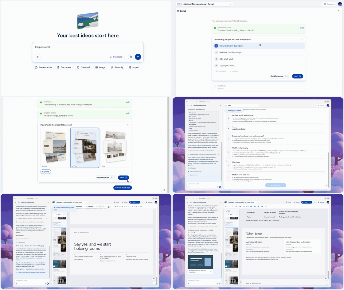
Give Gamma 5 whatever you have: a sentence, a doc, a PDF, an image, an old deck. The agent will then brainstorm, research, and design a polished presentation within minutes.
Generate now
Pixel-perfect import and export
Bring in PDF and PPT designs for ongoing use. Edit however you'd like, then export as PPT, PDF, or Google Slides. Your changes stay intact.
Import now
All your tools, connected
Skip the copy-and-paste. Connect Slack, Notion, Granola, and 20+ other tools to bring in context directly. Gamma builds the story around your data.
Connect tools
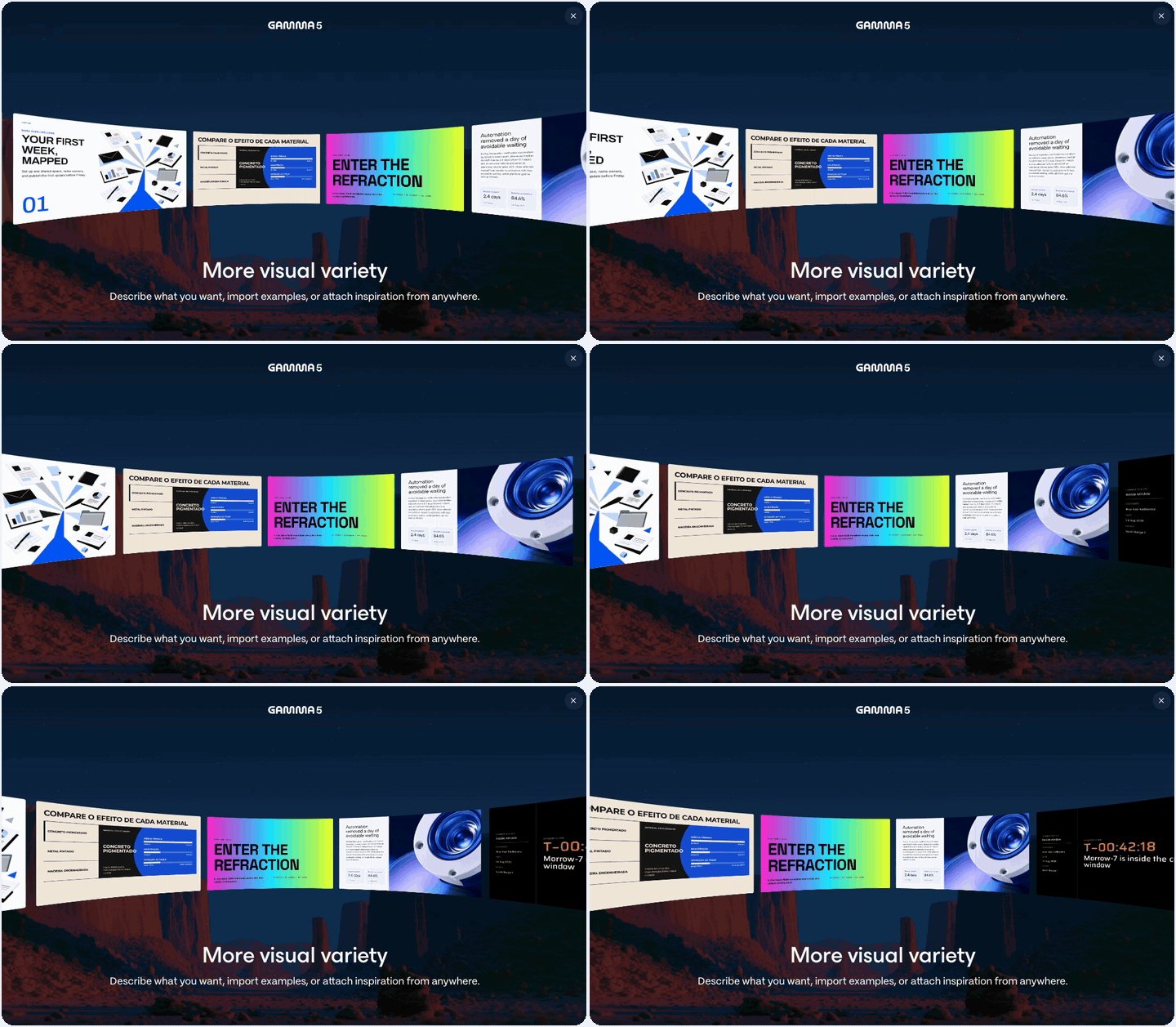
A new level of visual variety
Describe the look you want, or share visual inspiration. Gamma tailors a style to your goal, so the result is specific to your content, not generic.
Get started
Everything you've created is right where you left it.
Try Gamma in Beta
See You Soon
Team Gamma
Need help? Have a question? Check out our YouTube and Help Center or contact our Support Team.
View online Unsubscribe
2261 Market Street #4544 San Francisco, CA 94114https://gamma.app/
© 2026 Gamma Tech, Inc., All rights reserved.

![GIF: .pptx in, restyle, .pptx out]](https://userimg-assets.customeriomail.com/images/client-env-116622/01M3QAB1QBDDD82MMHHG57F3DE.gif)