Subject line
#outlook a {
padding: 0;
}
.ReadMsgBody {
width: 100%;
}
.ExternalClass {
width: 100%;
}
.ExternalClass * {
line-height: 100%;
}
body {
margin: 0;
padding: 0;
-webkit-text-size-adjust: 100%;
-ms-text-size-adjust: 100%;
}
table,
td {
border-collapse: collapse;
mso-table-lspace: 0pt;
mso-table-rspace: 0pt;
}
img {
border: 0;
height: auto;
line-height: 100%;
outline: none;
text-decoration: none;
-ms-interpolation-mode: bicubic;
}
p {
display: block;
margin: 13px 0;
}
96
.outlook-group-fix {
width: 100% !important;
}
@media only screen and (max-width: 480px) {
.dys-desktop {
display: none !important;
}
div.dys-mobile {
display: block !important;
}
tr.dys-mobile {
display: table-row !important;
}
}
@media only screen and (max-width: 480px) {
table.full-width-mobile {
width: 100% !important;
}
td.full-width-mobile {
width: auto !important;
}
}
u + #body a {
color: #0e1318;
text-decoration: none;
font-size: inherit;
font-family: inherit;
font-weight: inherit;
line-height: inherit;
}
a {
color: #0e1318;
text-decoration: none;
}
/* Buttery smooth fonts */
html {
font-size: 100%;
-webkit-text-size-adjust: 100%;
font-variant-ligatures: none;
-webkit-font-variant-ligatures: none;
text-rendering: optimizeLegibility;
-moz-osx-font-smoothing: grayscale;
font-smoothing: antialiased;
-webkit-font-smoothing: antialiased;
text-shadow: rgba(0, 0, 0, 0.01) 0 0 1px;
}
.button {
background: #00c4cc !important;
border-radius: 4px;
color: #ffffff !important;
display: inline-block;
font-family: Open Sans, Helvetica, Arial, sans serif;
font-size: 14px;
font-weight: 600;
line-height: 160%;
margin: 0;
padding: 9px 16px;
}
.show-for-mobile table {
mso-hide: all;
}
.monoGreyLight {
color: #edf0f2;
}
.monoBlack {
color: #0e1318;
}
.colorCanvaBrand {
color: #00c4cc;
}
.monoBlackA100 {
color: #565a5d;
}
.monoBlackA150 {
color: #6e7174;
}
.monoBlackA200 {
color: #939597;
}
.monoBlackA400 {
color: #e8e9e9;
}
.monoBlackA500 {
color: #eeeeef;
}
.monoWhite {
color: #fff;
}
.monoGrey {
color: #293039;
}
.show-for-large {
display: block;
}
.hide-for-large {
display: none;
}
.wrapper {
background-color: #edf0f2;
}
.wrapper-padding {
padding: 0 48px;
}
.wrapper-margin {
width: 48px;
}
.wrapper-typography {
padding: 12px 48px;
}
.wrapper-margin-wide {
width: 140px;
}
.header-bottom {
height: 36px;
}
.card-image {
width: 38.8%;
}
.card-content {
width: 61.2%;
}
.grid-cta {
background: #f8f9f9;
border-radius: 4px;
border: 1px solid #e8e9e9;
}
.word-break,
word-break > div {
word-break: break-all;
}
.device-image-container table {
margin: auto;
}
.grid-cta-button {
border: 1px solid #edf0f2;
border-radius: 4px;
}
.padding-quote {
padding: 80px 80px 80px 100px;
}
.desktop_hide,
.desktop_hide table {
mso-hide: all;
display: none;
max-height: 0;
overflow: hidden;
}
@media only screen and (max-width: 480px) {
.icon-image,
.icon-image table {
width: 70px !important;
}
.logo-image,
.logo-image table {
width: 106px !important;
}
.width-50-mobile {
width: 50% !important;
}
.wrapper-margin-narrow {
width: 14px !important;
}
.wrapper-margin-mobile {
width: 24px !important;
}
.top-10-copy-padding {
padding-left: 16px !important;
padding-right: 16px !important;
}
.top-10-copy-margin {
height: 16px !important;
line-height: 16px !important;
}
.card-horizontal .card-image {
width: 30%;
}
.card-horizontal .card-content {
width: 70%;
}
.card-contained .card-image {
display: table-footer-group !important;
width: 100% !important;
}
.card-contained .card-content {
display: table-caption;
width: 100% !important;
}
.card-template-stacked .card-image {
width: calc(100% - 32px) !important;
display: table-caption !important;
}
.card-template-stacked .card-content {
display: table-footer-group !important;
width: 100% !important;
}
.card-template-stacked .gutter {
display: none !important;
}
.card-template-stacked .card-content > p {
margin-top: 16px !important;
}
.card-horizontal-stacked,
.card-horizontal-stacked-reversed {
display: inline-block !important;
width: 100% !important;
}
.card-horizontal-stacked .card-content {
display: inline-block !important;
width: 100% !important;
}
.card-horizontal-stacked .card-image {
display: inline-block !important;
width: 100% !important;
}
.card-horizontal-stacked .gutter {
display: inline-block;
width: 100% !important;
height: 16px !important;
}
.card-horizontal-stacked-reversed .card-content {
display: table-caption !important;
width: 300px !important;
}
.card-horizontal-stacked-reversed .card-image {
display: table-footer-group !important;
width: 300px !important;
}
.card-horizontal-stacked-reversed .gutter {
display: table-header-group !important;
width: 300px !important;
}
.hide-for-mobile {
display: none !important;
}
.show-for-mobile {
display: block !important;
max-height: none !important;
}
.mobile_hide {
display: none !important;
}
.mobile_hide {
min-height: 0 !important;
max-height: 0 !important;
max-width: 0 !important;
overflow: hidden !important;
font-size: 0 !important;
}
.desktop_hide,
.desktop_hide table {
display: table !important;
max-height: none !important;
}
.font-smaller div,
.font-smaller {
font-size: 36px !important;
line-height: 38px !important;
}
.font-smaller-2 div,
.font-smaller-2 {
font-size: 30px !important;
line-height: 31px !important;
}
.font-smaller-3 div,
.font-smaller-3 {
font-size: 47px !important;
line-height: 48px !important;
}
.font-smaller-4 div,
.font-smaller-4 {
font-size: 22px !important;
line-height: 24px !important;
}
.font-smaller-28 div,
.font-smaller-28 {
font-size: 28px !important;
line-height: 29px !important;
}
.font-smaller-12 div,
.font-smaller-12 {
font-size: 12px !important;
line-height: 19px !important;
letter-spacing: 1px !important;
font-weight: 600 !important;
}
.font-smaller-16 div,
.font-smaller-16 {
font-size: 16px !important;
line-height: 23px !important;
}
.font-smaller-22 div,
.font-smaller-22 {
font-size: 22px !important;
line-height: 24px !important;
}
.font-smaller-58 div,
.font-smaller-58 {
font-size: 58px !important;
line-height: 55px !important;
}
.card-horizontal-stacked-reversed-alt {
display: block !important;
width: 100% !important;
}
.card-horizontal-stacked-reversed-alt tbody,
.card-horizontal-stacked-reversed-alt tbody tr {
width: 100% !important;
display: table !important;
}
.card-horizontal-stacked-reversed-alt .card-content {
display: table-caption !important;
width: 100% !important;
}
.card-horizontal-stacked-reversed-alt .card-image {
display: table-footer-group !important;
width: 100% !important;
}
.card-horizontal-stacked-reversed-alt .gutter {
display: table-header-group !important;
width: 100% !important;
}
.height_24 {
height: 24px !important;
line-height: 24px !important;
}
.padding-quote {
padding: 40px 40px 40px 58px;
}
.padding-70 {
padding: 70px !important;
}
.font-600,
.font-600 div {
font-weight: 600 !important;
}
.width-100 {
width: 100% !important;
max-width: 100% !important;
}
.column-stack {
display: block !important;
width: 100% !important;
}
.column-stack tbody,
.column-stack tbody tr {
width: 100% !important;
display: table !important;
}
.column-stack .column-lhs {
display: table-caption !important;
width: 100% !important;
}
.column-stack .column-rhs {
display: table-footer-group !important;
width: 100% !important;
}
.column-stack .column-gutter {
display: table-header-group !important;
width: 100% !important;
}
.text-xs,
.text-xs div,
.text-xs span {
font-size: 12px !important;
}
.text-xxs,
.text-xxs div,
.text-xxs span {
font-size: 11px !important;
}
.bg-n200 {
background-color: #f2f3f5 !important;
}
.va-top {
vertical-align: top !important;
}
.rounded-none {
border-radius: 0 !important;
}
.p-0 {
padding: 0px !important;
}
.pr-2 {
padding-right: 2px !important;
}
.pt-5 {
padding-top: 5px !important;
}
.pt-32 {
padding-top: 32px !important;
}
.pb-16 {
padding-bottom: 16px !important;
}
.w-16 {
width: 16px !important;
}
.w-1 {
width: 1px !important;
}
.h-1 {
height: 1px !important;
line-height: 1px !important;
}
.h-16 {
height: 16px !important;
line-height: 16px !important;
}
.h-20 {
height: 20px !important;
line-height: 20px !important;
}
.h-24 {
height: 24px !important;
line-height: 24px !important;
}
.h-78 {
height: 78px !important;
}
.w-full {
width: 100% !important;
max-width: 100% !important;
}
.w-20-percent {
width: 20% !important;
}
.w-30-percent {
width: 30% !important;
}
.font-26,
.font-26 div,
.font-26 span {
font-size: 26px !important;
}
.font-22,
.font-22 div,
.font-22 span {
font-size: 22px !important;
}
.font-20,
.font-20 div,
.font-20 span {
font-size: 20px !important;
}
.font-18,
.font-18 div,
.font-18 span {
font-size: 18px !important;
}
.font-12,
.font-12 div,
.font-12 span {
font-size: 12px !important;
}
.border-purple {
border: 1px solid #7300e6 !important;
border-radius: 4px !important;
border-collapse: separate !important;
}
.border-none {
border: 0px solid #ffffff !important;
}
}
@media only screen and (max-width: 648px) {
body {
background-color: #ffffff !important;
}
body > div {
background-color: #ffffff !important;
}
.wrapper {
background-color: #ffffff !important;
}
.footer-bg-mobile {
background-color: #ffffff !important;
}
.header-top-padding {
border-radius: 0 !important;
}
.header-top-padding td {
height: 24px !important;
line-height: 24px;
}
.show-for-large {
display: none !important;
}
.hide-for-large {
display: block !important;
}
.wrapper-padding {
padding: 0 24px !important;
}
.wrapper-margin {
width: 24px !important;
}
.wrapper-margin-wide {
width: 36px !important;
}
.header-bottom {
height: 12px;
line-height: 12px;
}
.wrapper-typography {
padding: 12px 24px !important;
}
.border-radius-for-large,
.border-radius-for-large img {
border-radius: 0 !important;
}
.spacing-for-large {
height: 1px !important;
line-height: 0 !important;
}
.image_grid .col {
width: 47%;
}
.full-image-block-spacing {
height: 24px !important;
}
.card-horizontal-image > table > tbody > tr > td {
padding: 0 24px 12px 24px !important;
}
.card-horizontal-content > table > tbody > tr > td {
padding: 12px 24px 0 24px !important;
}
.header-left {
display: table-footer-group !important;
width: 320px !important;
}
.header-right {
width: 320px !important;
display: table-caption !important;
}
.header-right th {
text-align: left !important;
}
.card-left {
padding: 0 12px 0 24px !important;
}
.card-right {
padding: 0 24px 0 12px !important;
}
}
@media only screen and (min-width: 480px) {
.dys-column-per-100 {
width: 100% !important;
max-width: 100%;
}
}
@import url(https://fonts.googleapis.com/css?family=Open+Sans:400,500,600,700);
Recursos para aprimorar suas habilidades de design
͏ ͏ ͏ ͏ ͏ ͏ ͏ ͏ ͏ ͏ ͏ ͏ ͏ ͏ ͏ ͏ ͏ ͏ ͏ ͏ ͏ ͏ ͏ ͏ ͏ ͏ ͏ ͏ ͏ ͏ ͏ ͏ ͏ ͏ ͏ ͏ ͏ ͏ ͏ ͏ ͏ ͏ ͏ ͏ ͏ ͏ ͏ ͏ ͏ ͏ ͏ ͏ ͏ ͏ ͏ ͏ ͏ ͏ ͏ ͏ ͏ ͏ ͏ ͏ ͏ ͏ ͏ ͏ ͏ ͏ ͏ ͏ ͏ ͏ ͏ ͏ ͏ ͏ ͏ ͏ ͏ ͏ ͏ ͏ ͏ ͏ ͏ ͏ ͏ ͏ ͏ ͏ ͏ ͏ ͏ ͏ ͏ ͏ ͏ ͏
Crie com o Canva
Receba nossas boas-vindas ao Canva! Que tal aprimorar suas habilidades de design? Comece aprendendo a personalizar modelos, adicionar elementos, usar fontes e cores, e muito mais.
Comece com um tutorial
Primeiros passos no Canva: recursos para iniciantes
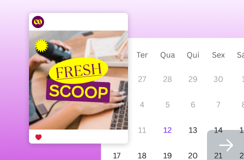
Explore seu potencial criativo e dê vida às suas ideias. Esses recursos vão ajudar você a começar.
Aprenda o básico
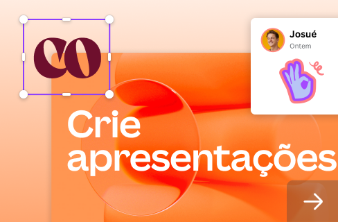
Crie apresentações
Aprimore seu conteúdo para redes sociais
Conheça nossas ferramentas de IA
Vamos manter contato
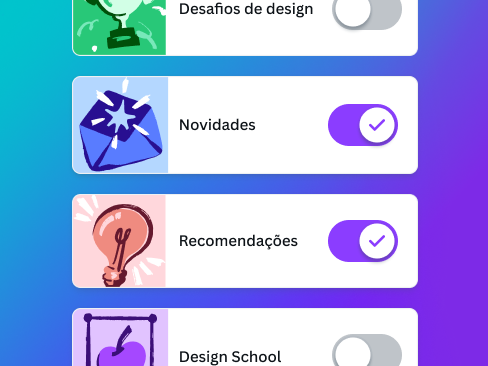
Quer mais dicas para deixar seu trabalho ainda melhor? Gerencie suas Notificações para ficar sempre por dentro de tudo que interessa você.
Você recebeu este e-mail porque se registrou no Canva.
Use o Canva nestas plataformas:
iPhone
iPad
Android
Mac
Windows
Baixe o app do Canva
Feito para você com pelo Canva
Canva Pty Ltd, 110 Kippax St, Sydney, 2010, Australia. ABN 80 158 929 938
Se precisar de ajuda, entre em contato conosco através da nossa Central de Ajuda.
Acesse canva.com
Cancelar inscrição na lista de e-mails
Preferências de mensagens


 pelo Canva


