Da: "Perplexity" <team@mail.perplexity.ai>
A: galuna@withoutemail.com
Data: 2026-09-13T12:25:36.000Z
Welcome to Perplexity
#outlook a { padding:0; }
body { margin:0;padding:0;-webkit-text-size-adjust:100%;-ms-text-size-adjust:100%; }
table, td { border-collapse:collapse;mso-table-lspace:0pt;mso-table-rspace:0pt; }
img { border:0;height:auto;line-height:100%; outline:none;text-decoration:none;-ms-interpolation-mode:bicubic; }
p { display:block;margin:13px 0; }
96
.mj-outlook-group-fix { width:100% !important; }
@import url(https://fonts.googleapis.com/css?family=Arial:400,600);
@media only screen and (min-width:480px) {
.mj-column-per-100 { width:100% !important; max-width: 100%; }
.mj-column-per-15 { width:15% !important; max-width: 15%; }
.mj-column-per-85 { width:85% !important; max-width: 85%; }
.mj-column-per-50 { width:50% !important; max-width: 50%; }
}
.moz-text-html .mj-column-per-100 { width:100% !important; max-width: 100%; }
.moz-text-html .mj-column-per-15 { width:15% !important; max-width: 15%; }
.moz-text-html .mj-column-per-85 { width:85% !important; max-width: 85%; }
.moz-text-html .mj-column-per-50 { width:50% !important; max-width: 50%; }
@media only screen and (max-width:479px) {
table.mj-full-width-mobile { width: 100% !important; }
td.mj-full-width-mobile { width: auto !important; }
}
.wfix {
max-width: 600px !important;
}
@media(max-width: 480px) {
.body-image-mobile-width-600 td { width: 600px !important; } .body-image-mobile-width-25 td { width: 25px !important; } .body-image-mobile-width-246 td { width: 246px !important; } .body-image-mobile-width-400 td { width: 400px !important; }
.body-image td { max-width: 100% !important; }
.body-image img { box-sizing: border-box; }
.social-icon-mobile-spacer {
display: inline-block !important;
}
}
.mobile-only { display: none !important; } .desktop-only { display: block !important; }
@media(max-width: 480px) { .column-stack { width: 100% !important; max-width: 100% !important; display: block !important; } .column-stack > table > tbody > tr > td,.column-stack > table > tbody > tr > th { padding-left: 0 !important; padding-right: 0 !important; } .mobile-only { display: block !important; } .desktop-only { display: none !important; } }
@media (min-width: 481px) {
.column-row { display: table !important; table-layout: fixed; width: 100% !important; }
.column-row > .column-stack, .column-row > .column-persist { display: table-cell !important; float: none !important; }
.mobile-only { display: none !important; }
}
.wrapper {
padding: 0 12px;
}
/* Superhuman selector */
.ShadowHTML .wrapper {
padding: 0 !important;
}
.ShadowHTML :is(.styleUnquotedContent .unquoted-content, .styleUnquotedContent .sh-unquoted-content, .styleQuotedContent .sh-quoted-content, .sh-signature, .Signature-settings) :is(td.column-container, div[class^="mj-column-per-"]){font-size:0!important}
html.sh-color :is(td.column-container, div[class^="mj-column-per-"], div.mj-column-per-100.mj-outlook-group-fix){font-size:0!important}
@media(max-width:480px){
html.sh-color .column-stack{width:100%!important;max-width:100%!important;display:block!important}
html.sh-color :is(.column-stack > table > tbody > tr > td,.column-stack > table > tbody > tr > th){padding-left:0!important;padding-right:0!important;width:100%!important;max-width:100%!important;display:block!important}
html.sh-color :is(.column-stack, .column-stack *){word-break:break-word!important;overflow-wrap:anywhere!important}
html.sh-color :is(.column-persist, .column-persist *){word-break:break-word!important;overflow-wrap:anywhere!important}
}
html.sh-color a[href^="tel:"]{color:inherit!important;text-decoration:none!important;font-size:inherit!important;line-height:inherit!important;letter-spacing:inherit!important;vertical-align:baseline!important}
.isMarketing { background-color: #fbfbfb !important; }
.isMarketing .styled-primary-column { background-color: #091717 !important; border-radius: 0px; }
[class~="x_social-icon-dark-mode"] { display: none !important; mso-hide:all; width: 0px !important; padding: 0px !important; }
/* Gmail selectors */
u + .body .wrapper {
padding: 0 !important;
}
div > u + .body .wrapper {
padding: 0 !important;
}
a { text-decoration: none; color: #fff; }
.link-unsubscribe { color: #9ca3af !important; }
Turn any question into a trusted answer
͏​  ­͏​  ­͏​  ­͏​  ­͏​  ­͏​  ­͏​  ­͏​  ­͏​  ­͏​  ­͏​  ­͏​  ­͏​  ­͏​  ­͏​  ­͏​  ­͏​  ­͏​  ­͏​  ­͏​  ­͏​  ­͏​  ­͏​  ­͏​  ­͏​  ­͏​  ­͏​  ­͏​  ­͏​  ­͏​  ­͏​  ­͏​  ­͏​  ­͏​  ­͏​  ­͏​  ­͏​  ­͏​  ­͏​  ­͏​  ­͏​  ­͏​  ­͏​  ­͏​  ­͏​  ­͏​  ­͏​  ­͏​  ­͏​  ­͏​  ­͏​  ­͏​  ­͏​  ­͏​  ­͏​  ­͏​  ­͏​  ­͏​  ­͏​  ­͏​  ­͏​  ­͏​  ­͏​  ­͏​  ­͏​  ­͏​  ­͏​  ­͏​  ­͏​  ­͏​  ­͏​  ­͏​  ­͏​  ­͏​  ­͏​  ­͏​  ­͏​  ­͏​  ­͏​  ­͏​  ­͏​  ­͏​  ­͏​  ­͏​  ­͏​  ­͏​  ­͏​  ­͏​  ­͏​  ­͏​  ­͏​  ­͏​  ­͏​  ­͏​  ­͏​  ­͏​  ­͏​  ­͏​  ­͏​  ­͏​  ­͏​  ­͏​  ­͏​  ­͏​  ­͏​  ­͏​  ­͏​  ­͏​  ­͏​  ­͏​  ­͏​  ­͏​  ­͏​  ­͏​  ­͏​  ­͏​  ­͏​  ­͏​  ­͏​  ­͏​  ­͏​  ­͏​  ­͏​  ­͏​  ­͏​  ­͏​  ­͏​  ­͏​  ­͏​  ­͏​  ­͏​  ­͏​  ­͏​  ­͏​  ­͏​  ­͏​  ­͏​  ­͏​  ­͏​  ­͏​  ­͏​  ­͏​  ­͏​  ­͏​  ­͏​  ­͏​  ­͏​  ­͏​  ­͏​  ­͏​  ­͏​  ­͏​  ­͏​  ­͏​  ­͏​  ­͏​  ­͏​  ­͏​  ­͏​  ­͏​  ­͏​  ­͏​  ­͏​  ­͏​  ­͏​  ­͏​  ­͏​  ­͏​  ­͏​  ­͏​  ­͏​  ­͏​  ­͏​  ­͏​  ­͏​  ­͏​  ­͏​  ­͏​  ­͏​  ­͏​  ­
a { text-decoration: underline !important; } .button a { text-decoration: none !important; } .outlook-list-fix { margin-left:4px !important; } .outlook-break-full-link { word-break: break-all !important; } .outlook-hide-social-icon { display: none !important; mso-hide:all; width: 0px !important; padding: 0px !important; } .outlook-hide-social-icon * { display: none !important; mso-hide:all; width: 0px !important; padding: 0px !important; } .outlook-hide-social-icon table { display: none !important; mso-hide:all; width: 0px !important; padding: 0px !important; } .outlook-hide-social-icon tbody { display: none !important; mso-hide:all; width: 0px !important; padding: 0px !important; } .outlook-hide-social-icon tr { display: none !important; mso-hide:all; width: 0px !important; padding: 0px !important; } .outlook-hide-social-icon td { display: none !important; mso-hide:all; width: 0px !important; padding: 0px !important; } .outlook-hide-social-icon img { display: none !important; mso-hide:all; width: 0px !important; padding: 0px !important; } .outlook-hide-social-icon a { display: none !important; mso-hide:all; width: 0px !important; padding: 0px !important; }
Get answers to your biggest questions, backed by sources you can trust.
Perplexity can turn any question into a concise and sourced explanation.
Ask your first question
Getting started
Turn a search into an answer
Ask something like, “What are the main arguments on both sides of remote work?” and get a balanced summary with citations instead of a long list of links.
Try it now →
Explore your sourcesOpen a cited page, then ask Perplexity to clarify, compare, or explain specific parts
Try it now →
Connect your tools
Use Perplexity alongside your email, documents, and browser to draft messages, summarize content, and explore ideas without constantly switching tools.
Try it now →
What makes Perplexity unique
Answers with sources
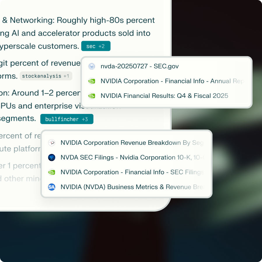
Every answer includes citations so you can see where information is coming from.
Real-time web search
Perplexity combines live web results.
Multi-modal orchestration
Perplexity uses the top AI models and selects the best one for each query.
Answers, not links
Get concise answers instead of a list of links.
Ask your first question
Millions of people use Perplexity to speed up research, planning, and everyday decision-making
Available everywhere you work
Perplexity works across all your devices
© 2026 Perplexity. 115 Sansome St, Suite 900, San Francisco, CA 94104Unsubscribe | Privacy Policy | Terms and conditions