De: "Lieferando" <newsletter@update.lieferando.de>
Para: alex@withoutemail.com
Data: 2026-09-05T14:57:15.000Z
96
Lieferando
@font-face { font-family: 'JETSans-Regular'; font-style: normal; font-weight: 400; src: url('https://res.cloudinary.com/jet-dam-crm/raw/upload/Email/SFMC%20Template%20Images/fonts/JETSans-Regular.woff'); src: local('JETSans-Regular'), url('https://res.cloudinary.com/jet-dam-crm/raw/upload/Email/SFMC%20Template%20Images/fonts/JETSans-Regular.woff') format('woff'); } @font-face { font-family: 'JETSans-Bold'; font-style: normal; font-weight: 700; src: url('https://res.cloudinary.com/jet-dam-crm/raw/upload/Email/SFMC%20Template%20Images/fonts/JETSans-Bold.woff'); src: local('JETSans-Bold'), url('https://res.cloudinary.com/jet-dam-crm/raw/upload/Email/SFMC%20Template%20Images/fonts/JETSans-Bold.woff') format('woff'); } @font-face { font-family: 'JETSans-ExtraBold'; font-style: normal; font-weight: 800; src: url('https://res.cloudinary.com/jet-dam-crm/raw/upload/Email/SFMC%20Template%20Images/fonts/JETSans-ExtraBold.woff'); src:
local('JETSans-Bold'), url('https://res.cloudinary.com/jet-dam-crm/raw/upload/Email/SFMC%20Template%20Images/fonts/JETSans-ExtraBold.woff') format('woff'); } @font-face { font-family: 'JETSans-Black'; font-style: normal; font-weight: 900; src: url('https://res.cloudinary.com/jet-dam-crm/raw/upload/Email/SFMC%20Template%20Images/fonts/JETSans-Black.woff'); src: local('JETSans-Black'), url('https://res.cloudinary.com/jet-dam-crm/raw/upload/Email/SFMC%20Template%20Images/fonts/JETSans-Black.woff') format('woff'); } @font-face { font-family: 'JETSans-BlackItalic'; font-style: normal; font-weight: 900; src: url('https://res.cloudinary.com/jet-dam-crm/raw/upload/Email/SFMC%20Template%20Images/fonts/JETSans-BlackItalic.woff'); src: local('JETSans-BlackItalic'), url('https://res.cloudinary.com/jet-dam-crm/raw/upload/Email/SFMC%20Template%20Images/fonts/JETSans-BlackItalic.woff') format('woff'); } @font-face { font-family: 'JETSans-ExtraBlack'; font-style: normal;
font-weight: 1000; src: url('https://res.cloudinary.com/jet-dam-crm/raw/upload/Email/SFMC%20Template%20Images/fonts/JETSans-ExtraBlack.woff'); src: local('JETSans-ExtraBlack'), url('https://res.cloudinary.com/jet-dam-crm/raw/upload/Email/SFMC%20Template%20Images/fonts/JETSans-ExtraBlack.woff') format('woff'); } @font-face { font-family: 'JETSans-ExtraBlackItalic'; font-style: normal; font-weight: 1000; src: url('https://res.cloudinary.com/jet-dam-crm/raw/upload/Email/SFMC%20Template%20Images/fonts/JETSans-ExtraBlackItalic.woff'); src: local('JETSans-ExtraBlackItalic'), url('https://res.cloudinary.com/jet-dam-crm/raw/upload/Email/SFMC%20Template%20Images/fonts/JETSans-ExtraBlackItalic.woff') format('woff'); }
html { height: 100%; width: 100%; margin: 0; padding: 0; background-color: #ffffff; } body { background-color: #ffffff; -webkit-text-size-adjust: none; -ms-text-size-adjust: none; -webkit-font-smoothing: antialiased; margin: 0 !important; padding: 0 !important; width: auto !important; } .ReadMsgBody { width: 100%; background-color: #efedea; } .ExternalClass { width: 100% !important; min-width: 640px; background-color: #efedea; } .ExternalClass * { line-height: 100%; background-color: #efedea; } table { border-collapse: collapse; mso-table-lspace: 0pt; mso-table-rspace: 0pt; } table td { border-collapse: collapse; border: 0; } table td a { color: inherit; } th { padding: 0; font-weight: normal; } p { margin: 0; padding: 0; margin-bottom: 0; } img { line-height: 100%; outline: none; text-decoration: none; border: 0px; } img[goomoji], img.CToWUd, .CToWUd { display: inline-block !important; padding: 0px !important; margin: 0px !important; }
.show { display: none; } .content-wrapper { margin: 0 auto; } .footer-area { background-color: #efedea !important; } h1, h2, h3 {
margin: 0px !important; } * { -webkit-text-size-adjust: none !important; } .fullBleed-2-1 { height: 320px; } .fullBleed-1-1 { height: 640px; } .fullBleed-3-2 { height: 427px; } .fullBleed-4-3 { height: 480px; } .imageTab-1-1 { height: 558px; } .imageTab-3-4 { height: 742px; } .imageTab-4-3 { height: 418px; } .float-left { float: left !important; } .float-right { float: right !important; } .text-center { text-align: center !important; } .flexicard-headline-big { font-size: 35px !important; line-height: 32px !important; padding-bottom: 20px !important; } .flexicard-body-only { padding-bottom: 0 !important; } .voucher-code-width { min-width: 440px !important; }
@media only screen and (max-width: 480px) { *, *::before, *::after { box-sizing: border-box; } body { width: auto !important; } .wrapper { min-width: 300px !important; } .content-wrapper { width: 100% !important; margin: 0 auto; } .full-width { width: 100% !important; max-width: 100% !important; min-width: 100% !important; } .full-width-img img { width: 100% !important; height: auto !important; display: block !important; } .column, .column-spacer, .column-spacer2, .column-spacer-small { display: block !important; width: 100% !important; height: auto !important; } .column-spacer { height: 20px !important; } .column-spacer-small { height: 10px !important; } .column-spacer-50 { height: 50px !important; } .nav { padding: 0 8px !important; } .center { text-align: center
!important; } table.center { margin: 0 auto !important; float: none; } .left { text-align: left !important; } table.left { float: left !important; } .pad-lr-20 { padding-left: 20px !important; padding-right: 20px !important; } .pad-lr-25 { padding-left: 20px !important; padding-right: 25px !important; } .pad-lr-30 { padding-left: 30px !important; padding-right: 30px !important; } .mobile-hide { display: none !important; } .mobile-show { display: table-cell !important; } .show { display: block !important; margin: 0 !important; padding: 0 !important; overflow: visible !important; width: auto !important; max-height: inherit !important; line-height: inherit !important; } .border-off { border: none !important; } .border-on { border-top: 1px dashed #d6d6d6 !important; } .font-10 { font-size:
10px !important; } /* New JET Style Classes */ .hero-cta-mobile, .reco-stack-mobile { max-width: 100% !important; } .h1 { font-size: 36px !important; line-height: 36px !important; } .h2 { font-size: 20px !important; line-height: 20px !important; } .h3 { font-size: 14px !important; line-height: 14px !important; } .voucher-code-font-size-mobile { font-size: 18px !important; padding-left: 20px !important; padding-right: 20px !important; } .text-align-center { text-align: center !important; } .max-width-130 { max-width: 130px !important; height: 130px !important; } .padding-bottom-20 { padding-bottom: 20px !important; } .margin-bottom-20 { margin-bottom: 20px !important; } .td-stack-top { display: block !important; /* width: 100%; padding-bottom: 5px !important; */ } .td-stack-bottom {
display: block !important; width: 100% !important; } .div-stack-top { display: block !important; max-width: 100% !important; padding-bottom: 20px; } .div-stack-bottom { display: block !important; max-width: 100% !important; } .free-delivery-padding { padding-bottom: 10px !important; } .reco-display-tag-padding { padding-top: 0 !important; padding-bottom: 10px !important; } .header-height-mobile { height: 80px !important; } .secondary-cta-mobile { display: block !important; } .padding-top-10 { padding-top: 10px; } .loyalty-shop-card-img { width: 150px !important; } .w100 { width: 100% !important; } .restaurant-name-v3 { height: 100px !important; } .logo-tab { height: auto !important; max-height: 60px !important; max-width: 50% !important; } .hero-title-large, .hero-title-medium { font-size: 48px !important; padding-left: 30px !important; padding-right: 30px !important; } .hero-title-small { font-size: 26px !important; padding-left: 30px !important; padding-right:
30px !important; } .voucher-box-mobile { width: auto !important; } .voucher-code-mobile { font-size: 18px !important; padding-left: 0 !important; padding-right: 0 !important; } .compact-banner-body { padding-top: 0 !important; padding-right: 30px !important; } .flexicard { width: 50% !important; padding: 20px !important; }
.flexicard-headline, .flexicard-headline-small { font-size: 18px !important; line-height: 20px !important; padding-bottom: 8px !important; } .flexicard-headline-big { font-size: 22px !important; line-height: 25px !important; } .flexicard-body, .flexicard-body-only { font-size: 14px !important; line-height: 20px !important; padding-bottom: 10px !important; } .flexicard-body-only { padding-bottom: 0 !important; } .flexicard-button { font-size: 18px !important; padding: 8px 20px !important; } .flexicard-hyperlink { font-size: 18px !important; } .iconstep-img { width: 64px !important; height: 64px !important; } .iconstep-headline { font-size: 26px !important; line-height: 28px !important; } .triplecontent-img { width: 100% !important; height: auto !important; } .triplecontent-body { padding:
0 !important; padding-top: 20px !important; } .recommendations-v3-rating-cuisines { font-size: 14px !important; } .recommendations-v3-item { width: 18px !important; height: auto !important; } .recommendations-v3-tag { font-size: 13px !important; } .recommendations-v4-delivery { padding-top: 5px !important; } .recommendations-v4-button-row { padding-top: 20px !important; } .recommendations-v4-button { padding: 12px 45px !important; } .float-right { float: none !important; } .announcementbar-copy { font-size: 14px !important; } .navbar-copy { font-size: 12px !important; } .dishlevelrecom-img-bg { width: 90px !important; height: 80px !important; } .dishlevelrecom-img { width: 80px !important; } .dishlevelrecom-desc-desktop { display: none !important; } .dishlevelrecom-desc-mobile { display:
inline !important; } .secondary-voucher-icon { width: 55px !important; } .secondary-voucher-headline { font-size: 24px !important; } .voucher-code-width { min-width: 0px !important; } }
@media only screen and (max-width: 640px) { .device100 { width: 100% !important; padding: 0; height: auto !important; float: none !important; } .device95 { width: 95% !important; padding: 0; height: auto !important; float: none !important; } .device90 { width: 90% !important; padding: 0; height: auto !important; float: none !important; } .device85 { width: 85% !important; padding: 0; height: auto !important; float: none !important; } .device80 { width: 80% !important; padding: 0; height: auto !important; float: none !important; } .device100px { width: 100px !important; padding: 0; height: auto !important; float: none !important; } .device150px { width: 150px !important; padding: 0; height: auto !important; float: none !important; } /* MOBILE GLOBAL STYLES - DO NOT
CHANGE */ h1 { font-size: 22px !important; } h2 { font-size: 20px !important; } h3 { font-size: 18px !important; } p { font-size: 13px !important; } .pad-lr-20 { padding-left: 20px !important; padding-right: 20px !important; } .pad-lr-25 { padding-left: 20px !important; padding-right: 25px !important; } .pad-lr-30 { padding-left: 30px !important; padding-right: 30px !important; } .points-copy { font-size: 12px !important; } .fullBleed-2-1 { height: auto; min-height: 50vw !important; } .fullBleed-1-1 { height: auto; min-height: 100vw !important; } .fullBleed-3-2 { height: auto; min-height: 68vw !important; } .fullBleed-4-3 { height: auto; min-height: 75vw !important; } .imageTab-1-1 { height: auto; min-height: 87vw !important; } .imageTab-3-4 { height: auto; min-height: 116vw !important;
} .imageTab-4-3 { height: auto; min-height: 65vw !important; } }
@media only screen and (min-width: 480px) { .category-header { font-size: 32px !important; } .td-stack-top-desktop { display: block !important; padding-bottom: 10px !important; } .td-stack-bottom-desktop { display: block !important; } .restaurant-block-left-v2 { padding-right: 30px; } .restaurant-block-right-v2 { padding-left: 30px; } .recommendation-body-v1 { padding: 25px !important; padding-right: 19px !important; } .recommendation-body-v2 { padding: 30px !important; } .recommendation-block-left { padding-right: 10px !important; } .recommendation-block-right { padding-left: 10px !important; } .restaurant-header-v1 { height: 100px !important; } .restaurant-header-v2 { height: 155px !important; } .restaurant-header-v3 { height: 175px !important; }
.restaurant-name-v2 { font-size: 24px !important; } .restaurant-name-v3 { font-size: 24px !important; } .cuisine-type-v2 { font-size: 16px !important; } .cuisine-type-v3 { font-size: 16px !important; } .cta-v2 { font-size: 20px !important; } .cta-v3 { font-size: 16px !important; } }
@media only screen and (max-width: 400px) { .flexicard { padding: 15px !important; } .flexicard-headline { font-size: 16px !important; line-height: 18px !important; } .flexicard-headline-small { font-size: 14px !important; line-height: 15px !important; padding-bottom: 10px !important; } .flexicard-headline-big { font-size: 20px !important; line-height: 22px !important; padding-bottom: 15px !important; } .flexicard-button { font-size: 12px !important; padding: 6px 20px !important; } .flexicard-hyperlink { font-size: 12px !important; } }
@media only screen and (max-width: 345px) { .flexicard-headline-big { font-size: 16px !important; line-height: 18px !important; } .flexicard-body, .flexicard-body-only { font-size: 12px !important; line-height: 16px !important; } } /* Dark mode styles */ @media (prefers-color-scheme: dark) { /* Custom Dark Mode Background Color */ .reco-bgcolor-darkmode { background-color: #fafafa !important; } }
@media only screen and (max-width: 480px) { .timer-headline { font-size: 22px !important; } .timer { padding: 0 0px !important; } .timer-text { font-size: 9px !important; } .timer-splitter { width: 12px !important; } }
@media only screen and (max-width: 480px) { .grocery-category-block { padding-bottom: 15px !important; } .grocery-category-container { padding: 0 7px 15px !important; } .grocery-category-image-block, .grocery-category-image { height: 85px !important; max-height: 85px !important; } .grocery-category-image-block { padding: 10px 10px 0 !important; } .grocery-category-image { border-radius: 10px !important; } .grocery-category-copy-block { height: 70px !important; padding: 0 10px !important; } .grocery-category-copy { font-size: 12px !important; } .grocery-item-new-price { font-size: 13px !important; } .grocery-item-old-price { font-size: 11px !important; padding: 0 5px !important; } .grocery-item-cta-container { padding: 0 15px 15px !important; }
.grocery-item-cta-block { width: 100% !important; } .grocery-item-cta { padding: 12px 0 !important; } }
div.preheader
{ display: none !important; }
Gültig bis einschl. 08.09.2026
‌ ‌ ‌ ‌ ‌ ‌ ‌ ‌ ‌ ‌ ‌ ‌ ‌ ‌
‌ ‌ ‌ ‌ ‌ ‌ ‌ ‌ ‌ ‌ ‌ ‌ ‌ ‌
‌ ‌ ‌ ‌ ‌ ‌ ‌ ‌ ‌ ‌ ‌ ‌ ‌ ‌
‌ ‌ ‌ ‌ ‌ ‌ ‌ ‌ ‌ ‌ ‌ ‌ ‌ ‌
‌ ‌ ‌ ‌ ‌ ‌ ‌ ‌ ‌ ‌ ‌ ‌ ‌ ‌
‌ ‌ ‌ ‌ ‌ ‌ ‌ ‌ ‌ ‌ ‌ ‌ ‌ ‌
‌ ‌ ‌ ‌ ‌ ‌ ‌ ‌ ‌ ‌ ‌ ‌ ‌ ‌
‌ ‌ ‌ ‌ ‌ ‌ ‌ ‌ ‌ ‌ ‌ ‌ ‌ ‌
‌ ‌ ‌ ‌ ‌ ‌ ‌ ‌ ‌ ‌ ‌ ‌ ‌ ‌
‌ ‌ ‌ ‌ ‌ ‌ ‌ ‌ ‌ ‌ ‌ ‌ ‌ ‌
‌ ‌ ‌ ‌ ‌ ‌ ‌ ‌ ‌ ‌ ‌ ‌ ‌ ‌
‌ ‌ ‌ ‌ ‌ ‌ ‌ ‌ ‌ ‌ ‌ ‌ ‌ ‌
‌ ‌ ‌ ‌ ‌ ‌ ‌ ‌ ‌ ‌ ‌ ‌ ‌ ‌
‌ ‌ ‌ ‌ ‌ ‌ ‌ ‌ ‌ ‌ ‌ ‌ ‌
‌ ‌ ‌ ‌ ‌ ‌ ‌ ‌ ‌ ‌ ‌ ‌ ‌ ‌
‌ ‌ ‌ ‌ ‌ ‌ ‌ ‌ ‌ ‌ ‌ ‌ ‌ ‌
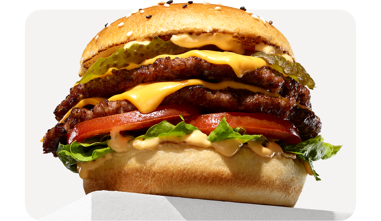
Jetzt genießen und 10 € sparen
LCWB10
*Gültig bis zum 08.09.2026. Der Mindestbestellwert pro Bestellung beträgt 20 €. Es gelten die AGB.
Jetzt bestellen
*Der 10 € Gutscheincode ist einmalig pro Kunde gültig und muss beim Bezahlvorgang auf Lieferando.de oder in der App eingegeben werden. Der Restbetrag muss mit einer der verfügbaren Online-Zahlungsmethoden beglichen werden. Der Mindestbestellwert pro Bestellung beträgt 20 €. Gutscheine dürfen nicht verkauft werden und können nicht ausgezahlt oder mit anderen Gutscheinen kombiniert werden. Lieferando behält sich das Recht vor, den Gutschein im Falle von Betrug oder Missbrauch zu stornieren. Für die Einlösung des Gutscheins gelten die Bedingungen des jeweiligen Restaurants. Gültig bis zum 08.09.2026.
Wie gefällt Dir diese E-Mail?
Kundenservice
Essen bestellen Impressum
Du hast diese E-Mail erhalten, weil du bei Lieferando eine Bestellung aufgegeben hast und wir denken, dass du gerne mehr über unsere Angebote und Services erfahren möchtest. Wenn du in Zukunft nicht mehr über Angebote und Vorteile von Lieferando benachrichtigt werden möchtest, klicke auf
Abmelden. Lieferando ist ein Angebot von Takeaway.comJust Eat Takeaway.com N.V. | Piet Heinkade 61 | 1019 GM Amsterdam© 2026 Takeaway.com E-Mail online ansehen.
This email was sent by:
Just Eat Takeaway.com N.V.
Oosterdoksstraat 80 Amsterdam, NOORD-HOLLAND,
1011DK, The Netherlands
Update Profile