96
@media only screen and (min-width: 650px) {
.p13_mm_offer_tag{font-size:14px!important;line-height:22px!important;}
.p13_mm_discounted_price{font-size:14px!important;line-height:20px!important;}
.p13_mm_original_price{font-size:14px!important;line-height:22px!important;}
.p13_mm_description{font-size:14px!important;line-height:22px!important;}
.gr_3_merchant{width:31%!important;}
.gr_4_merchant{width:22%!important;}
.p2_d_h4{font-size:24px!important;line-height:30px!important;}
.p13n_deal_l_d_16{font-size:16px!important;line-height:22px!important;}
.p13n_deal_l_d_24{font-size:20px!important;line-height:26px!important;padding:3px 6px!important;}
}
@media only screen and (max-width: 440px){
.m_to_50_percentage{width:50%!important;}
.temp_td_h5{ font-size: 16px !important; line-height: 22px !important; }
.temp_display_table{display:table !important;}
.temp_mob_reset{padding:0!important;}
.mobtac {text-align: center !important;}
.h3_p1{font-size:20px!important;line-height:26px!important;}
}
@media only screen and (max-width: 640px){
.left_aligned{text-align:left!important;}
.mob_h_130{height:130px!important;}
.card{height:auto!important;}
.img_312{max-width:none!important;}
}
@media only screen and (max-width: 350px){
.mob_h_73{height:73px!important;}
}
a {text-decoration: none;}
a[x-apple-data-detectors] { color: inherit !important; text-decoration: none !important; font-size: inherit !important; font-family: inherit !important; font-weight: inherit !important; line-height: inherit !important }
table{ mso-table-lspace: 0; mso-table-rspace: 0; border: none; border-collapse: collapse; border-spacing: 0;} p {margin: 0 !important;}
.body > img {display:block;}
.show670, .show414, .show430 {display:none;}
@media only screen and (max-width: 640px) {
u + .body ul, u + .body ol { margin-left: 18px !important;}
}
@media screen and (max-width:670px) {
.t1of12, .t2of12, .t3of12, .t4of12, .t5of12, .t6of12, .t7of12, .t8of12, .t9of12, .t10of12, .t11of12, .t12of12, .full { width: 100% !important; max-width: none !important; }
.show670 { display: block !important; max-height: none !important; overflow:visible !important; }
.hide670 { display: none !important; }
.mobheight0{height:0 !important; line-height: 0 !important;}
.mobheightAuto{height:auto !important;}
.mpt32{padding-top:32px !important;}
.mpb32{padding-bottom:32px !important;}
.mpb20{padding-bottom:20px !important;}
}
@media screen and (min-width:671px) {
.force700{width: 700px !important;}
.desktar {text-align: right !important;}
}
@media screen and (max-width:440px) {
.show430, .show414 { display: block !important; max-height: none !important; overflow:visible !important; }
.hide430, .hide414 { display: none !important; }
.mobtac{
text-align: center !important;
}
.mobdtable{
display:table !important;
max-width: none !important;
}
}
@font-face{font-family: 'UberMove-Medium'; src: url('https://tb-static.uber.com/prod/crm/assets/fonts/UberMove/UberMove-Medium.woff') format('woff'), url('https://tb-static.uber.com/prod/crm/assets/fonts/UberMove/UberMove-Medium.ttf') format('truetype'); font-weight: normal !important; font-style: normal !important; mso-font-alt: 'Arial'}
@font-face{font-family: 'UberMoveText-Regular'; src: url('https://tb-static.uber.com/prod/crm/assets/fonts/UberMove/UberMoveText-Regular.woff') format('woff'), url('https://tb-static.uber.com/prod/crm/assets/fonts/UberMove/UberMoveText-Regular.ttf') format('truetype'); font-weight: normal !important; font-style: normal !important; mso-font-alt: 'Arial'}
@font-face{font-family: 'UberMoveText-Medium'; src: url('https://tb-static.uber.com/prod/crm/assets/fonts/UberMove/UberMoveText-Medium.woff') format('woff'), url('https://tb-static.uber.com/prod/crm/assets/fonts/UberMove/UberMoveText-Medium.ttf') format('truetype'); font-weight: normal !important; font-style: normal !important; mso-font-alt: 'Arial'}
@font-face{font-family: 'UberMoveText-Bold'; src: url('https://tb-static.uber.com/prod/crm/assets/fonts/UberMove/UberMoveText-Bold.woff') format('woff'), url('https://tb-static.uber.com/prod/crm/assets/fonts/UberMove/UberMoveText-Bold.ttf') format('truetype'); font-weight: normal !important; font-style: normal !important; mso-font-alt: 'Arial'}
@font-face{font-family: 'Uber Move Text'; src: url('https://tb-static.uber.com/prod/crm/assets/fonts/UberMove/UberMoveText-Bold.woff') format('woff'), url('https://tb-static.uber.com/prod/crm/assets/fonts/UberMove/UberMoveText-Bold.ttf') format('truetype'); font-weight: bold; mso-font-alt: 'Arial'}
@font-face{font-family: 'Uber Move Text'; src: url('https://tb-static.uber.com/prod/crm/assets/fonts/UberMove/UberMoveText-Medium.woff') format('woff'), url('https://tb-static.uber.com/prod/crm/assets/fonts/UberMove/UberMoveText-Medium.ttf') format('truetype'); font-weight: 500; mso-font-alt: 'Arial'}
@font-face{font-family: 'Uber Move Text'; src: url('https://tb-static.uber.com/prod/crm/assets/fonts/UberMove/UberMoveText-Regular.woff') format('woff'), url('https://tb-static.uber.com/prod/crm/assets/fonts/UberMove/UberMoveText-Regular.ttf') format('truetype'); font-weight: normal; mso-font-alt: 'Arial'}
@font-face{font-family: 'Uber Move'; src: url('https://tb-static.uber.com/prod/crm/assets/fonts/UberMove/UberMove-Medium.woff') format('woff'), url('https://tb-static.uber.com/prod/crm/assets/fonts/UberMove/UberMove-Medium.ttf') format('truetype'); font-weight: 500; mso-font-alt: 'Arial'}
@font-face{font-family: 'Uber Move'; src: url('https://tb-static.uber.com/prod/crm/assets/fonts/UberMove/UberMove-Bold.woff') format('woff'); font-weight: 700; mso-font-alt: 'Arial'}
sup { line-height:0; font-size:70%; }
h1, .h1, .h1l{ font-size: 60px !important; line-height: 66px !important; }
.h1xl{ font-size: 96px !important; line-height: 96px !important; }
.hsubxl {font-size: 28px !important; line-height: 36px !important; font-family: 'Uber Move', 'Helvetica Neue', Helvetica, Arial, sans-serif !important; font-weight: 500 !important; }
.h1bl { font-size: 50px !important; line-height: 54px !important; }
h2, .h2, .h2l { font-size: 44px !important; line-height: 50px !important; }
ul, ol {padding-left:0; margin:0; margin-left:30px !important;}
u + .body ul, u + .body ol { margin-left: 30px !important; }
@media screen and (max-width:440px) {
h1, h2, .h1, .h1l, .h2{ font-size: 34px !important; line-height: 40px !important;}
.h1xl{ font-size: 64px !important; line-height: 64px !important;}
.h1scale, .h1lscale {font-size: 54px !important; line-height: 60px !important;}
.h2scale, .h2lscale {font-size: 42px !important; line-height: 48px !important;}
.hsubxl {font-size: 24px !important; line-height: 30px !important; font-family: 'Uber Move', 'Helvetica Neue', Helvetica, Arial, sans-serif !important; font-weight: 500 !important;}
.h1bl { font-size: 22px !important; line-height: 28px !important; }
.p1scale{font-size: 16px !important;line-height: 22px !important;}
}
@media screen and (max-width:375px) {
.h1xl{ font-size: 64px !important; line-height: 64px !important;}
.hsubxl { font-size: 20px !important; line-height: 26px !important; font-family: 'Uber Move Text', 'Helvetica Neue', Helvetica, Arial, sans-serif !important; font-weight: 700 !important; }
.h1scale {font-size: 46px !important; line-height: 52px !important;}
.h2scale {font-size: 40px !important; line-height: 46px !important;}
}
.nf25 .display{ font-size: 72px !important; line-height: 80px !important; }
.nf25 .h1{ font-size: 56px !important; line-height: 60px !important; }
.nf25 .h2{font-size: 40px !important;line-height: 44px !important;}
.nf25 .h3{font-size: 28px !important;line-height: 32px !important;}
p {margin: 0 !important;}
.shownotes{color:#0000ff;}
@media screen and (max-width:440px) {
.shownotes{color:#ff0000 !important;}
.nf25 .display{ font-size: 60px !important; line-height: 68px !important; }
.nf25 .h1{ font-size: 48px !important; line-height: 52px !important; }
.nf25 .h2{font-size: 36px !important;line-height: 40px !important;}
.nf25 .h3{font-size: 24px !important;line-height: 28px !important;}
.bptl { padding-top: 48px !important; }
.bptm { padding-top: 24px !important; }
.bpts { padding-top: 12px !important; }
.bpbl { padding-bottom: 48px !important; }
.bpbm { padding-bottom: 24px !important; }
.bpbs { padding-bottom: 12px !important; }
.hide {display: none !important;}
.show {display: inline-block !important; width:auto !important; height:auto !important; overflow:visible !important; float:none !important; visibility:visible !important; border:none !important; padding-bottom:0px !important; vertical-align: bottom !important;}
}
.show1 {
display: block !important;
max-height: none !important;
}
.mobfb414, .mobfb414 td{
padding-left:0 !important;
padding-right:0 !important;
max-width:430px !important;
}
.mobmw414{
max-width:430px !important;
}
.tCTA { text-decoration: underline !important; }
.ol_ul{text-decoration:underline !important;}
.ucta_3,.ol_ul{border-bottom:none !important;}
sup { line-height:0; font-size:70%; }
@media screen and (max-width:414px) {
.mobilebgcolor{
background-color: #00ff00 !important;
}
.hide {display: none !important;}
.show {display: inline-block !important; width:auto !important; height:auto !important; overflow:visible !important; float:none !important; visibility:visible !important; border:none !important; padding-bottom:0px !important; vertical-align: bottom !important;}
.show1 {
display: block !important;
max-height: none !important;
}
.mobh1 {font-size: 44px !important; line-height: 50px !important;}
.mobh2 {font-size: 34px !important;line-height: 40px !important;}
.p3mob {font-size:14px !important; line-height: 20px !important}
.h5mob{font-size: 24px !important; line-height:30px !important}
.h2m {font-size: 36px !important; line-height: 42px !important}
.width33 { max-width: 33% !important; width: 33% !important}
.width34 {max-width: 34% !important; max-width: 34% !important; }
}
@media (max-width: 614px) {
.h2_h4{font-size: 28px!important; line-height: 36px !important;}
}
Vergiss nicht, zu sparen!
͏ ͏ ͏ ͏ ͏ ͏ ͏ ͏ ­ ͏ ͏ ͏ ͏ ͏ ͏ ͏ ͏ ­
͏ ͏ ͏ ͏ ͏ ͏ ͏ ͏ ­ ͏ ͏ ͏ ͏ ͏ ͏ ͏ ͏ ­
͏ ͏ ͏ ͏ ͏ ͏ ͏ ͏ ­ ͏ ͏ ͏ ͏ ͏ ͏ ͏ ͏ ­
͏ ͏ ͏ ͏ ͏ ͏ ͏ ͏ ­ ͏ ͏ ͏ ͏ ͏ ͏ ͏ ͏ ­
͏ ͏ ͏ ͏ ͏ ͏ ͏ ͏ ­ ͏ ͏ ͏ ͏ ͏ ͏ ͏ ͏ ­
͏ ͏ ͏ ͏ ͏ ͏ ͏ ͏ ­ ͏ ͏ ͏ ͏ ͏ ͏ ͏ ͏ ­
͏ ͏ ͏ ͏ ͏ ͏ ͏ ͏ ­ ͏ ͏ ͏ ͏ ͏ ͏ ͏ ͏ ­
Restaurants
Lebensmittel
Einzelhandel
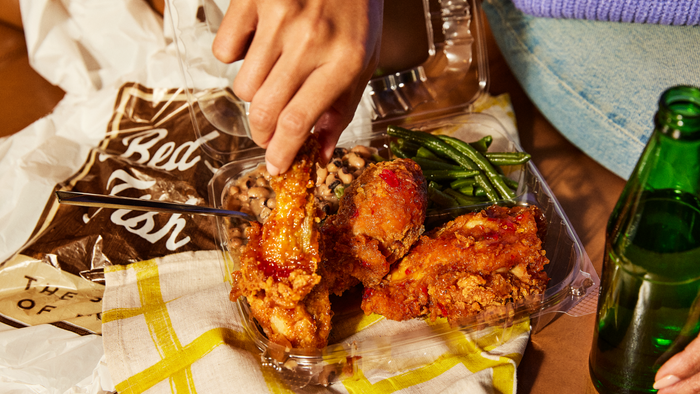
Bringe wieder etwas Schwung in deine Mahlzeiten
Entdecke Top Eats, um die Restaurants zu finden, die die Menschen vor Ort lieben. Du kannst dir auch beliebte Artikel auf den Speisekarten ansehen, die dir bei der Auswahl helfen.
Top Eats bestellen
@media only screen and (max-width: 450px) {
.h5_h4{font-size:20px!important;line-height:24px!important;}
.h5_h4_m_pad{padding-bottom:10px!important;}
.p2_fs14{font-size:14px!important;line-height:14px!important;}
}
@media screen and (min-width:700px) {
.u1_icon_d{max-width: 100px !important; }
.u1_n_space_d{max-height: 50px !important;}
}
Hungrig? Hier ist genau das richtige Angebot für dich
4.3
Kostenloser Artikel (Zahle 30 €)
4.3
Punjab Tandoori Restaurant
Jetzt bestellen
4.1
Zwei zum Preis von einem
4.1
Knusperhuhn Wiesloch
Jetzt bestellen
4.6
Bei ausgewählten Artikeln sparen
4.6
Koko Richie Wiesloch Altwiesloch
Jetzt bestellen
Hilfecenter
AGB
Abbestellen
Datenschutz
E-Mail-Einstellungen
Bilder oder Text wurden möglicherweise mit KI erstellt oder bearbeitet.
Uber Eats Germany GmbHPrenzlauer Allee 242-247, Haus 910405 BerlinGeschäftsführer: Giorgiana Ozana Alexandru, Blair Isaac Radford, Marinus van GestelSitz Berlin, Amtsgericht Charlottenburg, HRB 207056 B
Uber.com