96
@import url("https://assets.mlcdn.com/fonts.css?version=1773812");
.content-MS .content img { width: 560px; }
.mlContentButton a { text-decoration: none; }
.mlBodyBackgroundImage { background-image: none; }
.ReadMsgBody { width: 100%; }
.ExternalClass{ width: 100%; }
.ExternalClass * { line-height: 100%; }
.ExternalClass, .ExternalClass p, .ExternalClass td, .ExternalClass div, .ExternalClass span, .ExternalClass font { line-height:100%; }
body { margin: 0; padding: 0; }
body, table, td, p, a, li { -webkit-text-size-adjust: 100%; -ms-text-size-adjust: 100%; }
table td { border-collapse: collapse; }
table { border-spacing: 0; border-collapse: collapse; }
p, a, li, td, blockquote { mso-line-height-rule: exactly; }
p, a, li, td, body, table, blockquote { -ms-text-size-adjust: 100%; -webkit-text-size-adjust: 100%; }
img, a img { border: 0; outline: none; text-decoration: none; }
img { -ms-interpolation-mode: bicubic; }
* img[tabindex="0"] + div { display: none !important; }
a[href^=tel],a[href^=sms],a[href^=mailto], a[href^=date] { color: inherit; cursor: pointer; text-decoration: none; }
a[x-apple-data-detectors]{ color: inherit!important; text-decoration: none!important; font-size: inherit!important; font-family: inherit!important; font-weight: inherit!important; line-height: inherit!important; }
#MessageViewBody a { color: inherit; text-decoration: none; font-size: inherit; font-family: inherit; font-weight: inherit; line-height: inherit; }
#MessageViewBody { width: 100% !important; }
#MessageWebViewDiv { width: 100% !important; }
@-moz-document url-prefix() {
.bodyText p a, .bodyTitle p a {
word-break: break-word;
}
}
@media screen {
body {
font-family: 'Open Sans', Arial, Helvetica, sans-serif;
}
* {
direction: ltr;
}
}
@media only screen and (min-width:768px){
.mlEmailContainer{
width: 640px!important;
}
}
@media only screen and (max-width: 640px) {
.mlTemplateContainer {
padding: 10px 10px 0 10px;
}
} @media only screen and (max-width: 640px) {
.mlTemplateContainer{
padding: 10px 10px 0 10px;
}
} @media only screen and (max-width: 640px) {
.mlContentCenter{
min-width: 10%!important;
margin: 0!important;
float: none!important;
}
} @media only screen and (max-width: 640px) {
.mlContentTable{
width: 100%!important;
min-width: 10%!important;
margin: 0!important;
float: none!important;
}
} @media only screen and (max-width: 640px) {
.mlContentBlock{
display: block !important;
width: 100%!important;
min-width: 10%!important;
margin: 0!important;
float: none!important;
}
} @media only screen and (max-width: 640px) {
.mlContentOuter{
padding-bottom: 0px!important;
padding-left: 15px!important;
padding-right: 15px!important;
padding-top: 0px!important;
}
} @media only screen and (max-width: 640px) {
.mlContentOuterSmall{
padding-bottom: 0px!important;
padding-left: 10px!important;
padding-right: 10px!important;
padding-top: 0px!important;
}
} @media only screen and (max-width: 640px) {
.mlMenuOuter{
padding-bottom: 0px!important;
padding-left: 5px!important;
padding-right: 5px!important;
padding-top: 0px!important;
}
} @media only screen and (max-width: 640px) {
.mlContentOuterFullBig{
padding: 30px!important;
}
} @media only screen and (max-width: 640px) {
.mlContentImage img {
height: auto!important;
width: 100%!important;
}
} @media only screen and (max-width: 640px) {
.mlContentImage160 img {
height: auto!important;
max-width: 160px;
width: 100%!important;
}
} @media only screen and (max-width: 640px) {
.mlContentImage260 img {
height: auto!important;
max-width: 260px;
width: 100%!important;
}
} @media only screen and (max-width: 640px) {
.mlContentImage{
height: 100%!important;
width: auto!important;
}
} @media only screen and (max-width: 640px) {
.mlProductImage{
height: auto!important;
width: 100%!important;
}
} @media only screen and (max-width: 640px) {
.mlContentButton a{
display: block!important;
width: auto!important;
}
}
@media only screen and (max-width: 640px) {
.mobileHide{
display: none!important;
}
} @media only screen and (max-width: 640px) {
.mobileShow{
display: block!important;
}
} @media only screen and (max-width: 640px) {
.alignCenter{
height: auto!important;
text-align: center!important;
}
} @media only screen and (max-width: 640px) {
.alignCenter img{
display: inline !important;
text-align: center!important;
}
} @media only screen and (max-width: 640px) {
.marginBottom{
margin-bottom: 15px!important;
}
} @media only screen and (max-width: 640px) {
.marginTop {
margin-top: 10px !important;
}
} @media only screen and (max-width: 640px) {
.mlContentHeight{
height: auto!important;
}
} @media only screen and (max-width: 640px) {
.mlDisplayInline {
display: inline-block!important;
float: none!important;
}
} @media only screen and (max-width: 640px) {
.mlNoFloat{
float: none!important;
margin-left: auto!important;
margin-right: auto!important;
}
} @media only screen and (max-width: 640px) {
.mlContentSurvey{
float: none!important;
margin-bottom: 10px!important;
width:100%!important;
}
} @media only screen and (max-width: 640px) {
.mlContentSurvey td a{
width: auto!important;
}
} @media only screen and (max-width: 640px) {
.multiple-choice-item-table{
width: 100% !important;
margin-bottom: 20px !important;
min-width: 10% !important;
float: none !important;
}
} @media only screen and (max-width: 640px) {
body{
margin: 0px!important;
padding: 0px!important;
}
} @media only screen and (max-width: 640px) {
body, table, td, p, a, li, blockquote{
-webkit-text-size-adjust: none!important;
}
}
@media only screen and (max-width: 480px){
.social-LinksTable{
width: 100%!important;
}
} @media only screen and (max-width: 640px) {
.social-LinksTable td:first-child{
padding-left: 0px!important;
}
} @media only screen and (max-width: 640px) {
.social-LinksTable td:last-child{
padding-right: 0px!important;
}
} @media only screen and (max-width: 640px) {
.social-LinksTable td{
padding: 0 10px!important;
}
} @media only screen and (max-width: 640px) {
.social-LinksTable td img{
height: auto!important;
max-width: 48px;
width: 100%!important;
}
}
/* Carousel style */
@media screen and (-webkit-min-device-pixel-ratio: 0) {
.webkit {
display: block !important;
}
} @media screen and (-webkit-min-device-pixel-ratio: 0) {
.non-webkit {
display: none !important;
}
} @media screen and (-webkit-min-device-pixel-ratio: 0) {
/* TARGET OUTLOOK.COM */
[class="x_non-webkit"] {
display: block !important;
}
} @media screen and (-webkit-min-device-pixel-ratio: 0) {
[class="x_webkit"] {
display: none !important;
}
}
.bodyText { font-family: Arial, Helvetica, sans-serif!important ; }
.bodyText * { font-family: Arial, Helvetica, sans-serif!important; }
.bodyText a { font-family: Arial, Helvetica, sans-serif!important; }
.bodyText a span { font-family: Arial, Helvetica, sans-serif!important; }
.bodyText span { font-family: Arial, Helvetica, sans-serif!important; }
.bodyText p { font-family: Arial, Helvetica, sans-serif!important; }
.bodyText ul li { font-family: Arial, Helvetica, sans-serif!important; }
.bodyTitle { font-family: Arial, Helvetica, sans-serif!important ; }
.bodyTitle * { font-family: Arial, Helvetica, sans-serif!important; }
.bodyTitle a { font-family: Arial, Helvetica, sans-serif!important; }
.bodyTitle a span { font-family: Arial, Helvetica, sans-serif!important; }
.bodyTitle span { font-family: Arial, Helvetica, sans-serif!important; }
.bodyTitle p { font-family: Arial, Helvetica, sans-serif!important; }
.bodyFont { font-family: Arial, Helvetica, sans-serif!important ; }
.bodyFont * { font-family: Arial, Helvetica, sans-serif!important; }
.bodyFont a { font-family: Arial, Helvetica, sans-serif!important; }
.bodyFont a span { font-family: Arial, Helvetica, sans-serif!important; }
.bodyFont span { font-family: Arial, Helvetica, sans-serif!important; }
.bodyFont p { font-family: Arial, Helvetica, sans-serif!important; }
.mlContentButton { font-family: Arial, Helvetica, sans-serif!important; }
@media only screen and (max-width: 640px){
#logoBlock-4 {
max-width: 148.26254826254825px!important;
width: 100%!important;
height: auto!important;
}
}
@media only screen and (max-width: 640px){
#imageBlock-16 img {
max-width: 267px!important;
width: 100%!important;
}
}
@media only screen and (max-width: 640px){
#imageBlock-17 img {
max-width: 267px!important;
width: 100%!important;
}
}
@media only screen and (max-width: 640px){
#imageBlock-18 img {
max-width: 267px!important;
width: 100%!important;
}
}
@media only screen and (max-width: 640px){
#imageBlock-19 img {
max-width: 267px!important;
width: 100%!important;
}
}
Ready for the Next Step After Typio?
Explore improved accessibility, new features, and more for an enhanced classroom experience.
View in browser
You’ve Built the Skills.
Now Take the Next Step.
If you’ve been building skills with Typio, Accessibyte Studio was made for what comes next.
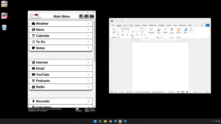
Accessibyte Studio is our accessible Windows desktop suite, bringing together practical tools for email, documents, reading, notes, web access, and more in one place.
It is designed for users who are ready to move beyond practice and start using their skills in everyday computer tasks.
Explore Accessibyte Studio
If you have questions or want help deciding whether Studio is right for you, just reply to this email.
Features
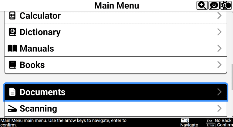
Accessibyte Studio provides easy access to the apps you need—all in a single, unified workspace.
View All Apps
Intuitive Navigation
Use just a few keys—Up, Down, Enter and Escape—to move through the app, making it effortless for users of all ages and skill levels.
Inclusive Design for All
Our built-in voicing and visual enhancements guide you every step of the way—no more struggling with complex tools.
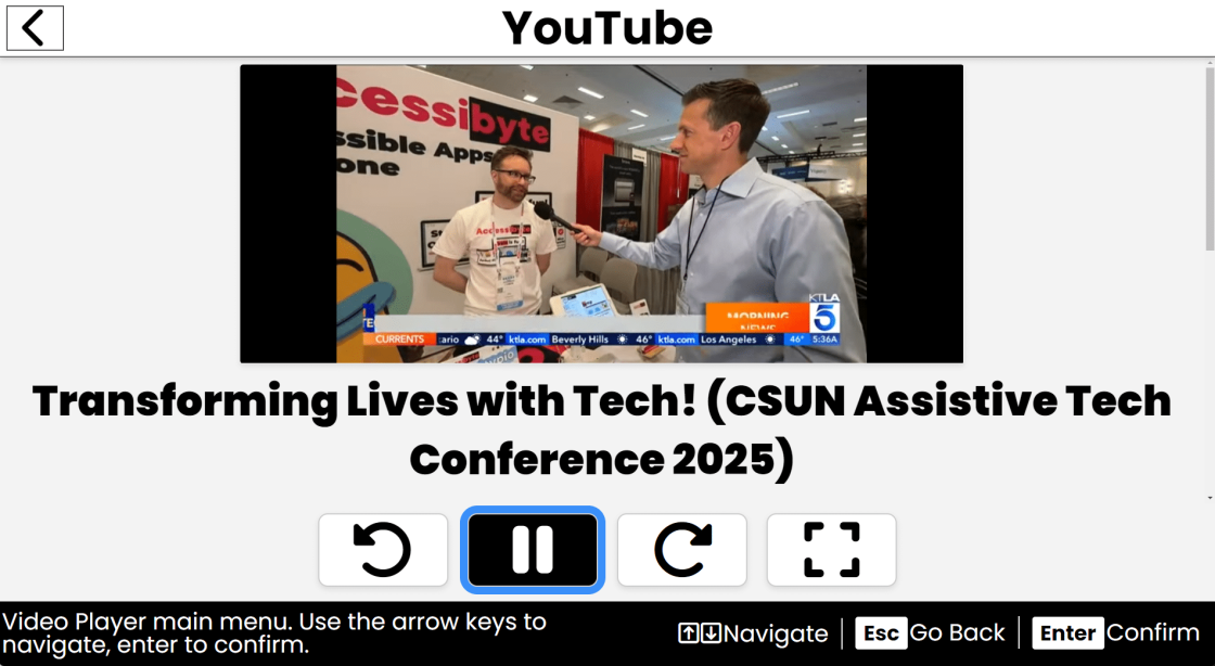
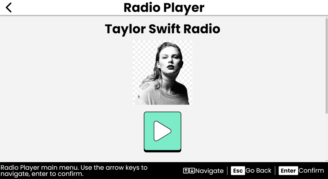
Simple Productivity
Dedicated modules for notes, internet browsing, email, YouTube, books, to-do lists, radio, news, manuals and more... All in one unified user-friendly app.
All Ages and Abilities
An easy all-in-one platform that does it all, or companion app that seamlessly integrates with your existing assistive technology.
Accessibyte
PO Box 633, Forest ParkIL 60130 United States
You received this email because you signed up on our website or made a purchase from us.
Unsubscribe